Strategies for Creating Convincing Restaurant and Retail Concepts in Rhino 3D
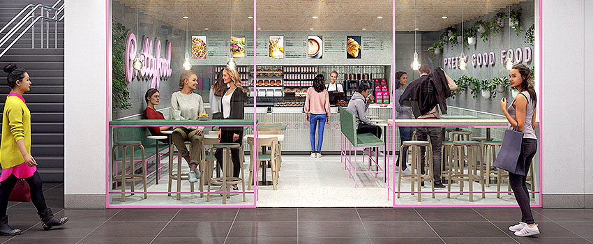
The design studio 16 Mammals from Netherlands creates Restaurant and Retail concepts in Rhino 3D. By using a combination of sketched Artwork, 3D drafts with included 3D People models and concept Renderings, they create believable and convincing concept projects.
In the following article they share interesting strategies and tips around their creation process. This involves designing and planning of different Restaurant locations and creating concept renderings with our Renderpeople 3D People models in their Rhinoceros 6 scenes.
I would like to thank Rick Porcelijn, Founder and Creative Director of 16 Mammals, as well as his creative design team for contributing to our blog and sharing insights and useful tips.
Please enjoy the following story from our friends at 16 Mammals:
Prettyfood – Creating a “fast-casual” Restaurant ArchViz Concept
Now, more than ever, good looks and a compelling experience are not enough when designing a successful shop or restaurant. What present day economics and Corona shows us is that all those other elements like what’s on the menu, routing, equipment, logistics and location need to be
economically and ecologically sustainable in the long run as well.
To showcase what such a ‘shock proof’ food service concept could look like, we bundled all our research on sustainable interior materials and sustainable food and mixed them with insights in social behavior. By doing so, designing the eco-positive ‘fast-casual’ restaurant of the future.
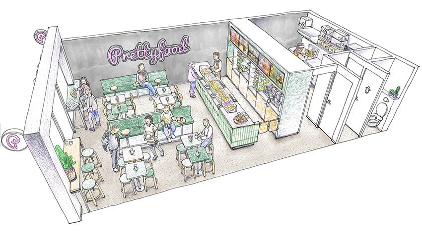
Early sketched preview of a Prettyfood Restaurant concept | 16 Mammals
Focus on impact reduction – keeping customer behavior in mind
To have a compelling showcase for our clients, this concept needed to be inspiring, yet realistic and scalable in the short term. In real life, realistic often means suitable for a broad audience and easy to adapt for any high traffic location. No matter the location, whether downtown, in malls or in train stations, both as ‘shop in shops’ or standalone stores.
A stronger focus on ‘to-go’ and ‘take away’ are becoming crucial as well. Combined with survey results, we’ve seen that despite the fact that most people wish for a healthy lifestyle, in reality they tend to purchase tasty but rather unhealthy snacks. And so, our concept needed to be pretty good food, but not really that healthy.
From Sketch to Concept – kitchen zoning and general layout strategy for retail concepts in Rhino 3D
We always start off with rough sketches as a visual recap of the assignment. We do this in order to validate all stakeholder requirements as well as any project preconditions. We then introduce these boundaries into the initial idea. Combining collages and a description of the menu, equipment and the overall business model, we move on to the next level: sketching the kitchen zoning.
Since fast food needs to be fast, we opted for a very basic menu with burgers, fries and salads. Tempting, convenient and all with the most advanced plant based meat and dairy alternatives. Orders can be placed directly at the multi-functional counter and service area. Most food is pre-packed and in direct line of sight, with large menu screens above to cater for customers waiting in line.
A ‘made to order’ hot food preparation kitchen, with state of the art equipment, is also placed right behind the hatch.

Comparison of a simple kitchen zoning model (left) and a simple layout model (right) with integrated 3D People models.
Adaptive Space – Keep the creation process flexible
We started with a global layout by moving placeholder blocks around the space with dimensions for the counter, kitchen, seating and so on. The seating needed to be arranged in a way to create a nice
atmosphere close to the entrance, without obstructing the waiting lines. This gave us a very rough idea of the layout.
Ergonomic guidelines are of course adhered to, but without materials, plants and props, it is really hard to actually ‘feel’ the space through the early computer models. This is why we select Renderpeople 3D People models who represent customers and add them at the very beginning as block instances into the model.
” We try to keep the 3D model light while at the same time allowing for a good feel of the space.”
Instead of designing the space and then adding the people, we begin with the people and design multiple spaces around them. Creating flexible and ‘shock proof’ layouts is important so that we can easily adapt to changing needs over time.
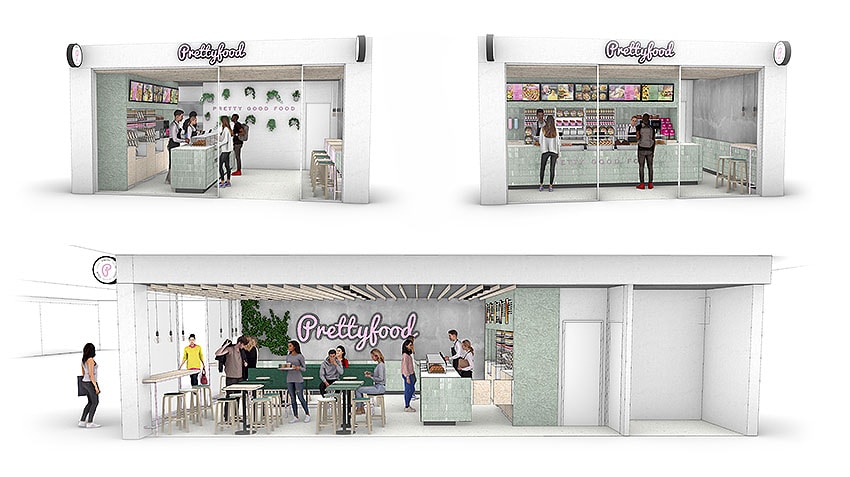
Different layouts with 3D People for adaptive spaces.
Expanding creativity – focus on creating convincing and appealing retail concepts in Rhino 3D
For the retail and fast casual concepts we work on, we like to use real people in all forms and colours, with casual clothing, just as you might expect to see on an ordinary day at the grocery store. We aim to create convincing and appealing images with an immediate realistic feel. This helps convey ideas to our clients in a clear and visual manner throughout the whole process, from initial concept to finalized design.
To avoid getting stuck early in the design process in the 3D model detailing funnel, we use the 3D models including the Renderpeople Shopping and Retail Models as a sketch underlay. By combining simple tools such as a LED light box, pencils and a little photoshop, outcomes are remarkably useful and speeds up ways of work for any designer in comparison to a traditional digital approach.
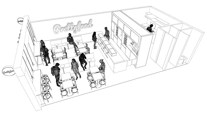

Comparison of sketched restaurant concept drawing and wireframe rendering
Exchanging process – Useful time saving tricks for retail concepts in Rhino 3D
What really is a nice little trick, that saves tons of nerves during projects like this, is that up until the very end of the project nothing is rendered. 3D People are placed into the concept and high resolution screen captures in Rhino3D are made. Pro’s and con’s are mapped and delivered in a PDF presentation together with the screen captures to the client for them to consult with their teams and stakeholders.
By doing so, we can exchange questions at a very high rate, saving valuable time and tackling pending issues together.
Right before the final design presentation, we make really nice looking architectural renderings. Together with our freelance expert https://www.mathijn.co/ using V-Ray for Rhino3D.
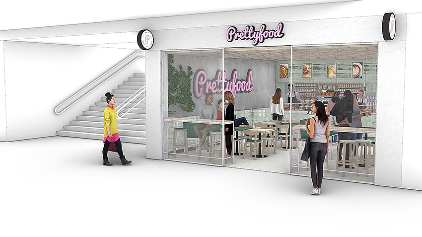
Choosing the right low impact materials
By choosing a plant based, seasonal and regional menu and minimising food waste, we have managed to tackle 75% of the ecological impact of the entire restaurant. To further reduce the impact, we’ve selected only low energy equipment, refurbished furniture and a special selection of
the most eco-friendly interior construction and finishing materials.
Focusing on low impact mono materials with a relatively high end life value. This helps ensure that clients can build a successful ‘shock proof’ restaurant, while saving money in the long run with well thought out materials to tackle value depreciation.
Building or designing environmental friendly projects yourself? You can find more on all eco positive topics, including food and lifestyle at Think Big Act Now.
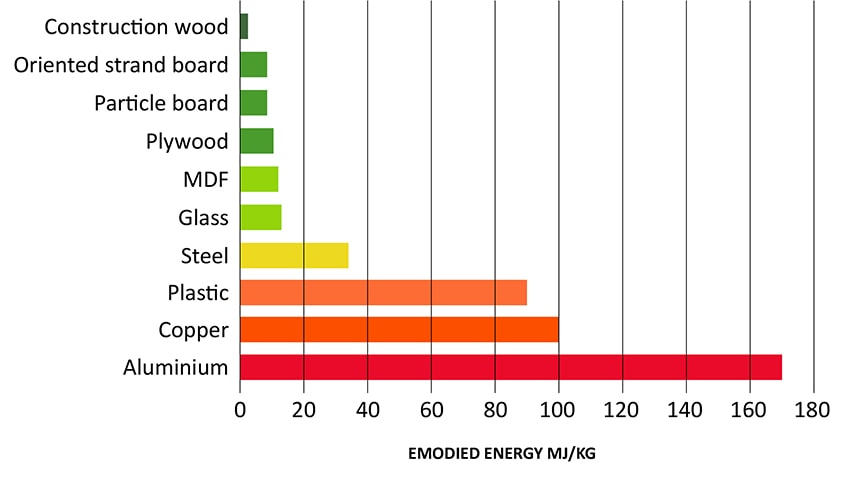
Comparison of different building and construction materials – Adopted from Wikipedia / Embodied Energy
Clients voice out they appreciate this fast design process. Adding valuable creative input and prove time and again to deliver successful ‘shock proof’ Retail and Restaurant concepts. Making it easy to keep optimizing these concepts to an ever changing world.
About 16 Mammals
www.16mammals.com | LinkedIn | Facebook | Twitter
16 Mammals designs sustainable and successful retail shops and food service formats.

